Plotting choropleth shapes
import geopandas as gpd
import matplotlib.pyplot as plt

import os

from cartopy.crs import PlateCarree

import geomappy as mp
import geomappy.plot_utils
os.chdir("../../../")
|Loading data on river plastic mobilisation when flood events happen (Roebroek et al., 2021).
df = gpd.read_file("data/countries/plastic_mobilisation.shp")
df.columns
Index(['featurecla', 'scalerank', 'LABELRANK', 'SOVEREIGNT', 'SOV_A3',
       'ADM0_DIF', 'LEVEL', 'TYPE', 'ADMIN', 'ADM0_A3',
       ...
       'NAME_ZH', 'e_1', 'e_10', 'e_20', 'e_50', 'e_100', 'e_200', 'e_500',
       'jump', 'geometry'],
      dtype='object', length=103)
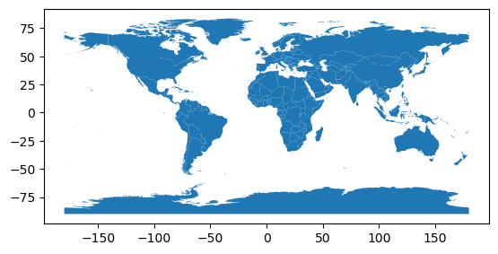
The data shows like this when plotted within the geopandas dataframe.
df.plot()
plt.show()
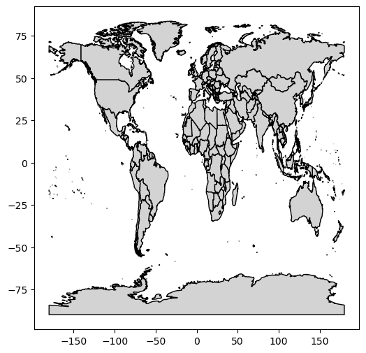
In its most simple form, the plot_shapes function does exactly the
same (with some minor esthetic changes)
mp.plot_shapes(df=df)
plt.show()
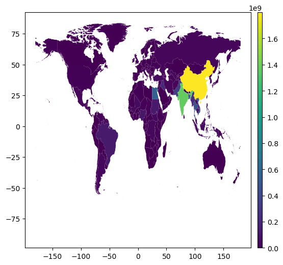
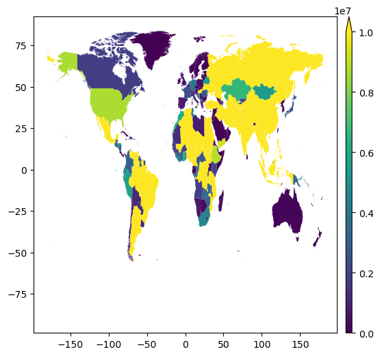
Choropleth capabilities are available when selecting a column to express
the values. In this case e_10 expresses plastic mobilisation when
relatively low-impact floods occur.
mp.plot_shapes(df=df, values='e_10')
plt.show()
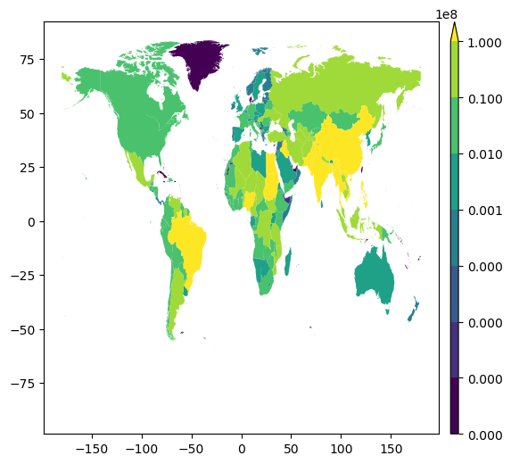
Similarly to plot_raster it provides vmin, vmax and bins
to enhance visibility.
mp.plot_shapes(df=df, values='e_10', vmax=10000000)
plt.show()
bins = [0, 100, 1000, 10000, 100000, 1000000, 10000000, 100000000]
mp.plot_shapes(df=df, values='e_10', bins=bins)
plt.show()
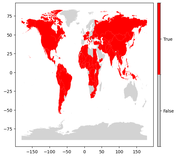
To plot a binary classification of the data, provide a single bin:
mp.plot_shapes(df=df, values='e_10', bins=[1000000])
plt.show()
Again a basemap is easily provided
f, ax = plt.subplots(figsize=(20, 20), subplot_kw={'projection': PlateCarree()})
bounds = df.total_bounds
extent = bounds[0], bounds[2], bounds[1], bounds[3]
ax.set_extent(extent)
geomappy.plot_utils.add_gridlines(ax, 30)
geomappy.plot_utils.add_ticks(ax, 30)

mp.plot_shapes(df=df, values='e_10', cmap="Reds", bins=bins, ax=ax)
plt.show()
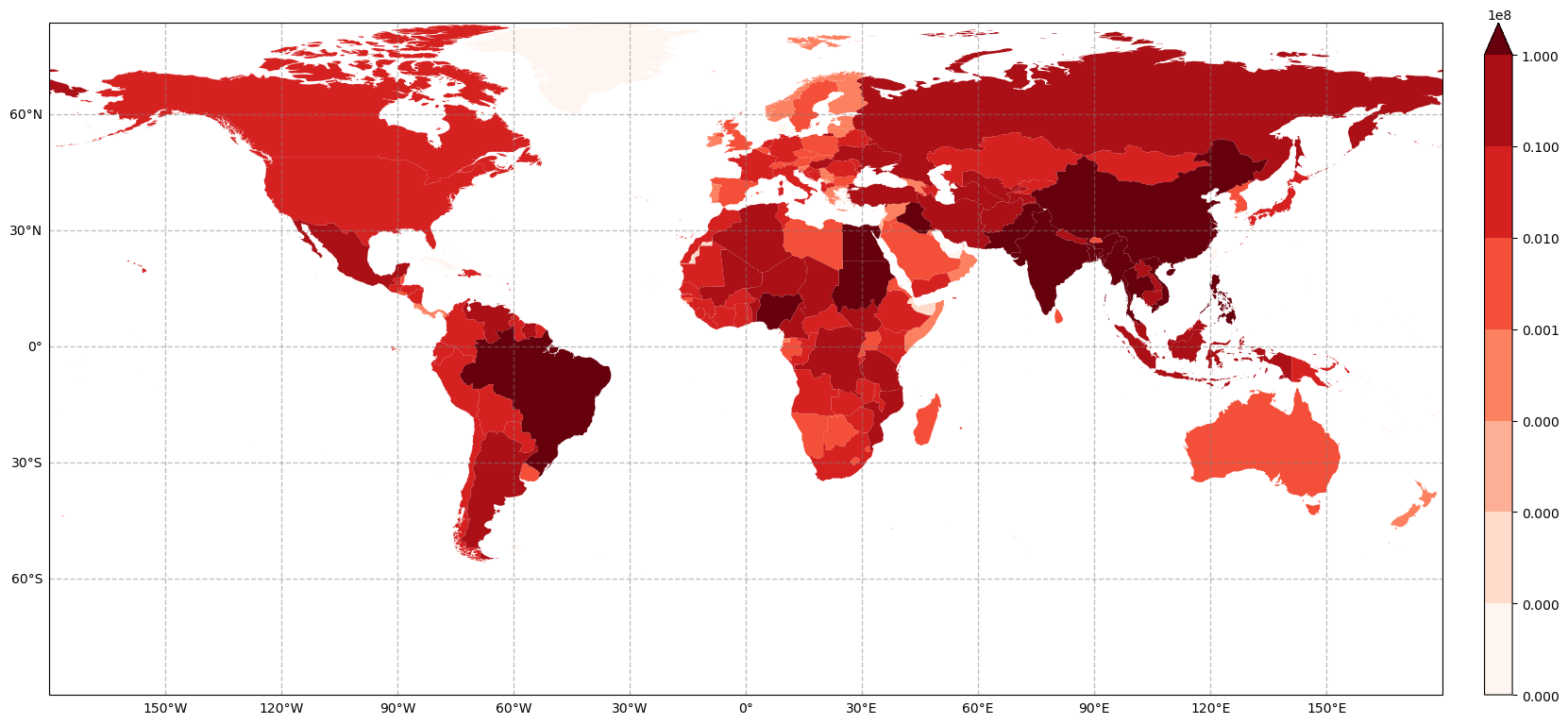
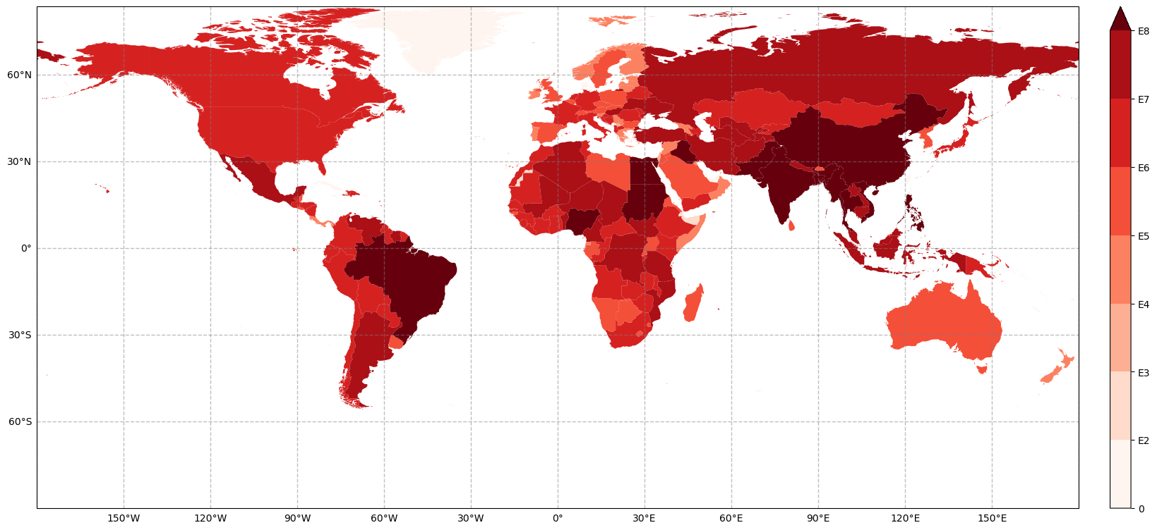
The legend is hard to interpret this way. To solve this, the legend items can be overloaded with their E notation. In addition, a customised label can be placed next to the colorbar.
f, ax = plt.subplots(figsize=(20, 20), subplot_kw={'projection': PlateCarree()})
bounds = df.total_bounds
extent = bounds[0], bounds[2], bounds[1], bounds[3]
ax.set_extent(extent)
geomappy.plot_utils.add_gridlines(ax, 30)
geomappy.plot_utils.add_ticks(ax, 30)

legend_ax = mp.create_colorbar_axes(ax=ax, width=0.02, pad=0.03)
im, l = mp.plot_shapes(df=df, values='e_10', cmap="Reds", bins=bins, ax=ax, legend_ax=legend_ax)
l.ax.set_yticks(l.ax.get_yticks(), [0, "E2", "E3", "E4", "E5", "E6", "E7", "E8"])

plt.show()