Note
This tutorial was generated from an IPython notebook that can be downloaded here.
Plotting discrete choropleth rasters
import rioxarray as rxr
import matplotlib.pyplot as plt
from cartopy.crs import PlateCarree

import geomappy as mp
import geomappy.plot_utils
import os
os.chdir("../../../")
Loading a global raster indicating climate zones (from Beck et al, 2019)
r = rxr.open_rasterio("data/climate_downsampled_10_display.tif")
a = r.values[0]
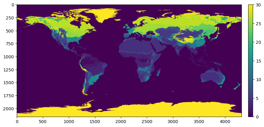
Plotting the raster shows that the climate zones are classified 1 to 30, instead of being labelled with their standard A-E formulation
f, ax = plt.subplots(figsize=(10, 10))
mp.plot_raster(a, ax=ax)
plt.show()
To map these numbers to their correct labels they are loaded from a text file:
colors = [(1, 1, 1)]
bins = [0]
labels = ["Water"]
with open("data/koppen_legend.txt") as f:
    for line in f:
        line = line.strip()
        try:
            int(line[0])
            rgb = [int(c) / 255 for c in line[line.find('[') + 1:-1].split()]
            colors.append(rgb)
            labels.append(line.split()[1])
            bins.append(int(line[:line.find(':')]))
        except:
            pass
The resulting lists colors, labels and bins provide the
information needed for plotting.
colors
[(1, 1, 1),
 [0.0, 0.0, 1.0],
 [0.0, 0.47058823529411764, 1.0],
 [0.27450980392156865, 0.6666666666666666, 0.9803921568627451],
 [1.0, 0.0, 0.0],
 [1.0, 0.5882352941176471, 0.5882352941176471],
 [0.9607843137254902, 0.6470588235294118, 0.0],
 [1.0, 0.8627450980392157, 0.39215686274509803],
 [1.0, 1.0, 0.0],
 [0.7843137254901961, 0.7843137254901961, 0.0],
 [0.5882352941176471, 0.5882352941176471, 0.0],
 [0.5882352941176471, 1.0, 0.5882352941176471],
 [0.39215686274509803, 0.7843137254901961, 0.39215686274509803],
 [0.19607843137254902, 0.5882352941176471, 0.19607843137254902],
 [0.7843137254901961, 1.0, 0.3137254901960784],
 [0.39215686274509803, 1.0, 0.3137254901960784],
 [0.19607843137254902, 0.7843137254901961, 0.0],
 [1.0, 0.0, 1.0],
 [0.7843137254901961, 0.0, 0.7843137254901961],
 [0.5882352941176471, 0.19607843137254902, 0.5882352941176471],
 [0.5882352941176471, 0.39215686274509803, 0.5882352941176471],
 [0.6666666666666666, 0.6862745098039216, 1.0],
 [0.35294117647058826, 0.47058823529411764, 0.8627450980392157],
 [0.29411764705882354, 0.3137254901960784, 0.7058823529411765],
 [0.19607843137254902, 0.0, 0.5294117647058824],
 [0.0, 1.0, 1.0],
 [0.21568627450980393, 0.7843137254901961, 1.0],
 [0.0, 0.49019607843137253, 0.49019607843137253],
 [0.0, 0.27450980392156865, 0.37254901960784315],
 [0.6980392156862745, 0.6980392156862745, 0.6980392156862745],
 [0.4, 0.4, 0.4]]
print(*labels)
Water Af Am Aw BWh BWk BSh BSk Csa Csb Csc Cwa Cwb Cwc Cfa Cfb Cfc Dsa Dsb Dsc Dsd Dwa Dwb Dwc Dwd Dfa Dfb Dfc Dfd ET EF
print(*bins)
0 1 2 3 4 5 6 7 8 9 10 11 12 13 14 15 16 17 18 19 20 21 22 23 24 25 26 27 28 29 30
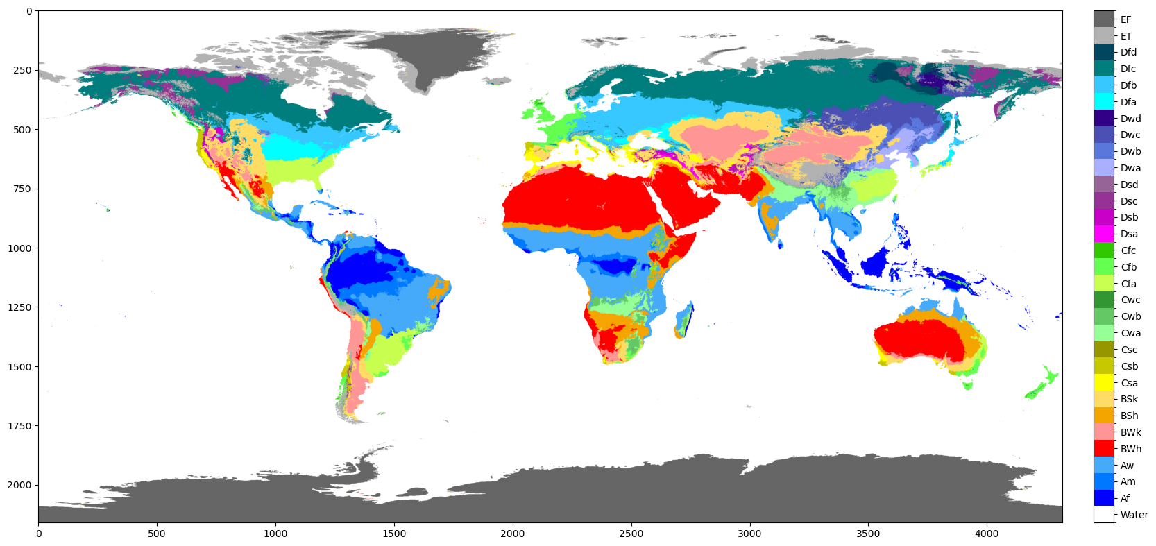
They are used as parameters in the plot_classified_raster function
f, ax = plt.subplots(figsize=(20, 20))
mp.plot_classified_raster(a, levels=bins, labels=labels, colors=colors, ax=ax)
plt.show()
/Users/jroebroek/Packages/geomappy/geomappy/plotting/raster.py:72: UserWarning: Using 31 levels may reduce plot visibility. Consider using 9 or fewer levels.
  colorizer = create_classified_colorizer(
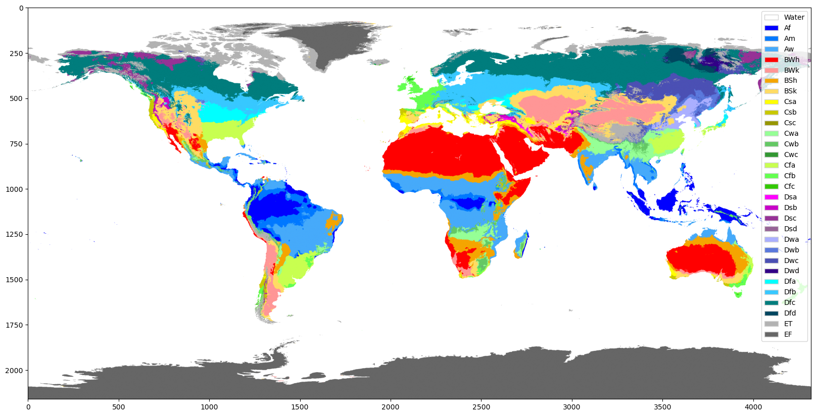
Also a legend can be used
f, ax = plt.subplots(figsize=(20, 20))
mp.plot_classified_raster(a, levels=bins, labels=labels, colors=colors, ax=ax, legend='legend')
plt.show()
/Users/jroebroek/Packages/geomappy/geomappy/plotting/raster.py:72: UserWarning: Using 31 levels may reduce plot visibility. Consider using 9 or fewer levels.
  colorizer = create_classified_colorizer(
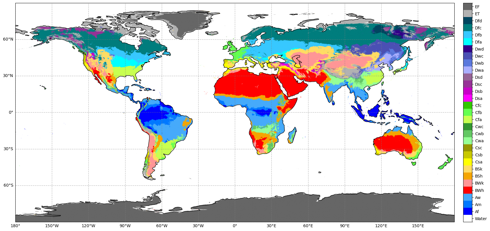
Again this can be easily enhanced with a basemap. The colorbar is made smaller as well.
f, ax = plt.subplots(figsize=(20, 20), subplot_kw={'projection': PlateCarree()})
ax.coastlines()
geomappy.plot_utils.add_gridlines(ax, 30)
geomappy.plot_utils.add_ticks(ax, 30)
bounds = r.rio.bounds()
extent = bounds[0], bounds[2], bounds[1], bounds[3]
legend_ax = mp.create_colorbar_axes(ax=ax, width=0.02, pad=0.02)
mp.plot_classified_raster(a, levels=bins, labels=labels, colors=colors, ax=ax, legend_ax=legend_ax, extent=extent)
plt.show()